
mmmm, samplers....
i'm feelin' a fever for putting these things together. thus far, i've taken ELEMENTS and motifs from samplers and worked them as isolated pieces, but now i'm really feeling the challenge of the bigger, more chock-full sampler. aside from taking more time, they are a challenge because i have to think about the spacing around each character. i guess it wouldn't be so difficult if i were working from a pattern book or something, but well, that's just not my style. i'm copying the fonts and letter styles of alphabets i've found on those old PA dutch samplers and arranging them to suit the size of the piece i want to make. this was the first one -- i'm relatively happy with it, but i can see changes i want to make and directions in which i'd like to explore. there are so many other letter styles out there! so many samplers to study! inspiration is never ending.....
(i do love the red on oatmeal color combo i've gone with.... i think it was inspired by a painting of penmanship practice that my friend greg did. the painting hangs in his living room. it's one of my favourite pieces of his artwork. i wish i had a photo i could show you...)
also going on is this:

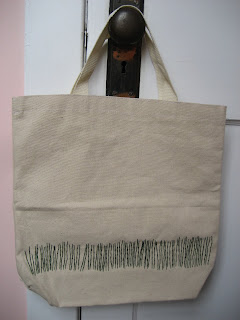
the green grass tote bag.
i was SUPER jazzed about this idea -- embroidering the line of grass blades along the bottom edge of the tote. once i started it though, i realized that it is WAY more work than i had anticipated. i didn't realize that little 3 inch straight lines would take me so long to do, but there are a lot of little lines...


i still love the idea, though, so i'm going to play with some print versions. ah, another challenge and adventure. i'm hoping to make that happen sometime this week... we'll see. (i listed the original on etsy; here.)


and, i'm strongly considering a change of paint in the studio. the pink i have on the walls now simply isnt doing it for me. it was beautiful in my brooklyn bedroom (and i am so happy to be able to still visit that bedroom when i see my friend laura, who has kept up the serious awesomeness of that pink room), but here, the paint finish is flat and blah. it looks really unfinished. so i'm thinking of doing it in that trendy blue color, the shade that's been in all the magazines for the past two years.. any suggestions on an exact paint shade?


2 comments:
Love, love, love the bag!!!!!
i love the bag too - but i can see how it would be so much work!
can't wait to see the printed version.
Post a Comment